 PixRinse
Screenshots show the English app. Preset names and controls are also available in your app language.
Your starting point
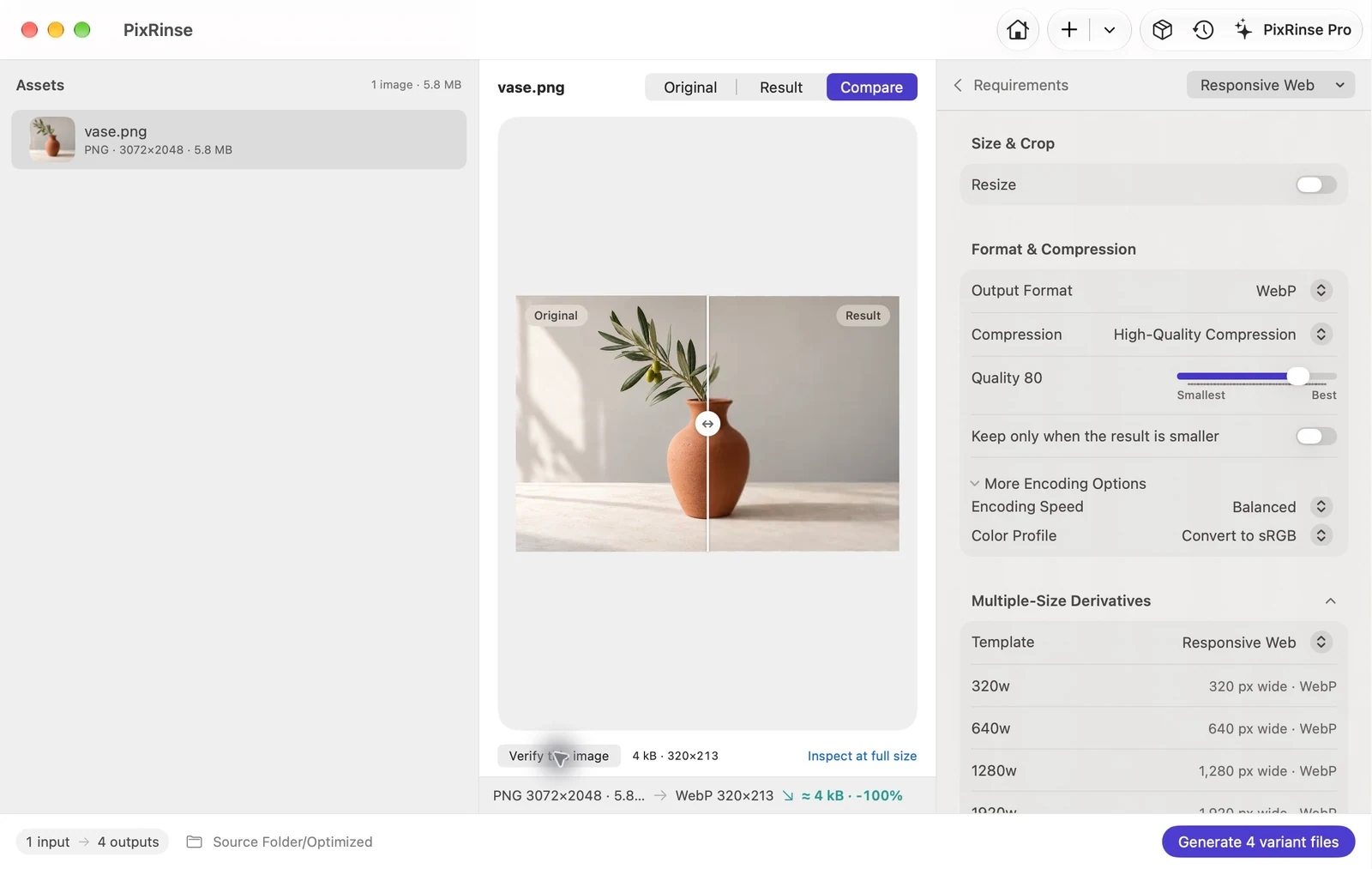
Use Responsive Web in PixRinse, then review these settings against your actual destination.
| Widths | 320 / 640 / 1280 / 1920 px |
|---|---|
| Output | WebP, quality 80 |
| Color | sRGB |
| Small sources | Larger variants are skipped |
How to do it
Start with the original asset
Use a source wide enough for the largest variant you need. Every derivative is generated from the original instead of being repeatedly resized.
Select Responsive Web
Review the four built-in widths and file names. Variants wider than the source are skipped, so inspect the planned output count.
Export the image set
Review all outputs. Multiple outputs per source require Pro; the free tier can still be used to test a single-size workflow.
Add the images to your page
Use width descriptors in srcset and set sizes to match the actual layout. Include accurate width, height and alternative text on the image element.
<img
  src="vase-1280w.webp"
  srcset="vase-320w.webp 320w,
          vase-640w.webp 640w,
          vase-1280w.webp 1280w,
          vase-1920w.webp 1920w"
  sizes="(max-width: 720px) 100vw, 960px"
  width="1280" height="853"
  alt="A terracotta vase with an olive branch"
>
THE FILES FROM THIS WALKTHROUGH
What this example produced
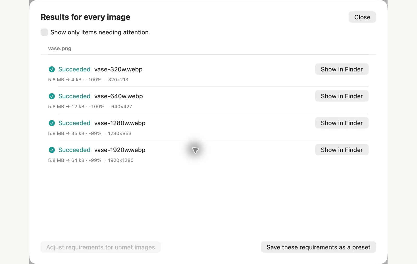
A 3072 px-wide source is large enough for all four preset widths. Each file is a separate WebP, generated directly from that source.
- Quality
- 80
- Color profile
- sRGB
- Outputs from one source
- 4
| File | Format | Pixels | Bytes |
|---|---|---|---|
| vase-1280w.webp | WebP | 1280 × 853 | 35,214 |
| vase-1920w.webp | WebP | 1920 × 1280 | 64,108 |
| vase-320w.webp | WebP | 320 × 213 | 4,018 |
| vase-640w.webp | WebP | 640 × 427 | 11,594 |
Measured on the sample files shown. Your results depend on your originals and settings. The ceramic-vase photograph is an AI-generated sample. The app screenshots and exported file measurements are real.
A couple of common questions
What happens if my source is only 1000 px wide?
The template skips the 1280 and 1920 px variants. Only reference files that were actually generated.
Does the app generate HTML?
This workflow produces images. Add srcset and sizes in your website code or content system.
Put the workflow to work.
Open PixRinse, add a few images and start with the settings above.
Download for MacFree: up to 10 images per batch and one output per source. This workflow’s multiple outputs require Pro. Compare Free & Pro.